Did you know that the Rule of Three in interior design can help your home look its best? Simply stated the Rule of Three is a design guideline that demonstrates people find odd-numbered groupings more visually pleasing. We prefer groupings of three, five, or seven. Typically we find beauty in asymmetrical placement. It applies to furniture placement, artwork, lighting, windows, decor, color palette, etc. To demonstrate the design rule, let’s focus on three areas to implement the Rule of Three in our homes: furniture placement, home decor, and color palette.
Furniture Placement:
The Rule of Three in furniture placement has been used for years. Furniture stores market furniture to us using this rule without our awareness. To illustrate this, let’s talk about living room furniture. One couch and two chairs typically fill our living rooms. Three places for one to sit. Beyond that, most couches are made with three cushions. In the bedroom, we have a bed and two bedside tables. At the bar in the kitchen, oftentimes there are three stools. You might have never noticed these things, but they exist to make a room feel naturally balanced.
Look around your home. Where do you already have furniture in odd-numbered groupings? Where can you implement the Rule of Three in your furniture placement?
Home Decor:

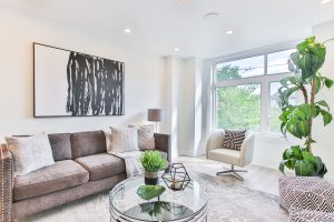
Can you find the Rule of Three in this room? Try to find at a minimum four examples.
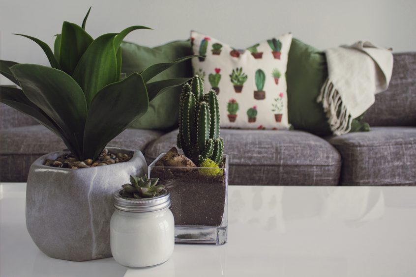
Have you ever thought someone must have an eye for design? If so, it is highly likely that they were following the Rule of Three in home decor. Group three similar items on a bookshelf. Stack three books on your coffee table. Place three throw pillows on your sofa. Hang three similar sized paintings on the same wall. None of these items have to match exactly; however, they should be similar in texture, shape, and/or color. For example in the photograph at the top of the page, three different cacti are arranged together in varying heights and with different containers. It is a perfect example of an unmatched grouping of three, and it works beautifully.
Don’t get carried away and clutter up your shelves, mantel, and bar areas. Clutter no matter how well grouped does not translate into a visually pleasing design.
Color Palette:
Most top interior designers choose three colors for a home. Within that choice, they employ a 60-30-10 rule. One color would fill 60% of the room/home. The secondary color will be evident 30%. Last but not least the accent color will fill the remaining 10%. I personally think this works best throughout the whole house and not room to room. Using the Rule of Three with your color palette allows for color unity within the house. You can use three shades of the same color; they don’t have to be contrasting colors.
If you love neutrals and want a clean white feel, it is still possible with the Rule of Three. A bright white, a cream, and a soft gray will help you achieve a beautifully neutral feel with three different colors. By using the Rule of Three, you will create a warmth and coziness with color instead of a cold, stark white color scheme. Check out the color chips at your local home improvement store. There are so many different shades of white. However if you love a loud color, make it your accent color and allow it to pop here and there so as to not overwhelm your space.
Again even though it is called the Rule of Three, think of it as a guideline to use in interior design. As you begin noticing the pleasing look of odd-numbered groupings, you will never flip through a magazine the same way. The Rule of Three will leap off the pages. Where can you implement the Rule of Three in your home to make it more visually pleasing?
To see more examples of the Rule of Three in interior design, click here.

